

Embed an interactive map onto any website! This is in continuation of the previous dataset created in the previous post. Create a bubble plot map using R to visualise transactions data!
Dataset Preparation
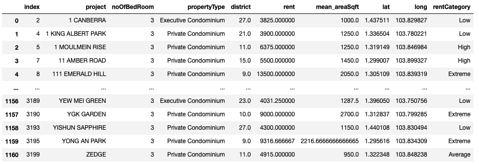
From our previous post, we have prepared a dataset that consists of the average rents of 3 bedrooms EC and Condos. A transaction rental record have been tagged as ‘Low’, Average’, High’, ‘Extreme’ according to the percentile category it falls under during the transaction’s Quarter. These 4 categories would then be represented with different bubble colours in the interactive map.
Actual Dataset
Leaflet and Bubble Plots using R
To add bubbles in specific locations, we use the addCircles function. The parameters lng and lat refer to the longitude and latitude. The radius determines the size of the bubble, which we set to be proportional to the square root of the average price. We define a colour palette to categorise our ‘Low’, Average’, High’, ‘Extreme’ rental records. We can also display a pop up when the user’s mouse hovers over the bubble. In our case we display the project name, average price, district.
Leaflet Map
library(leaflet)
library(htmltools)

#read three bedder condo csv
project_transactions_df = read.csv('transactions_three_bedder_23q3.csv')

# Define color palette
pal <- colorFactor(c('#4AC6B7','#C61951','#FF7070',"lightgreen"), domain = c("Low", "Average", "High", "Extreme"))

# Create html for new lines in label
labs <- lapply(seq(nrow(project_transactions_df)), function(i) {
     paste0( '<b>Project Name: </b>', project_transactions_df[i, "project"], '</br>',
             '<b>Average Rent ($): </b>',project_transactions_df[i, "rent"],'</br>',
            '<b>No of Bedroom: </b>',project_transactions_df[i, "noOfBedRoom"],'</br>',
             '<b>District : </b>',project_transactions_df[i, "district"],'</br>')
 })

m <- leaflet(project_transactions_df) %>%
    setView(lng = 103.8198, lat = 1.3521, zoom = 12) %>%
    setMaxBounds( lng1 = 103.600250,
                   lat1 = 1.202674,
                   lng2 = 104.027344,
                   lat2 = 1.484121 )%>%
    addTiles(options=tileOptions(opacity=0.6)) %>%
    addCircles(lng=~long, lat=~lat,
                radius=~sqrt(rent/10),
                color=~pal(rentCategory),
                weight=2,
                label=lapply(labs, HTML),
                stroke=TRUE,opacity=0.8,fillOpacity=0.5,
                #clusterOptions=markerClusterOptions(),
                layerId = ~project) %>%
    addLegend("topright", pal = pal,
               values = ~rentCategory,
               title = "Rent Category",
               opacity = 1)
m